Every brand present in the market is desperate to bring its identity to the heart of the people. Every advertisement has its own merits, but the focus of each brand is on its brand logo, because its identity only draws people to the showroom or shop. Whether it is Maruti in cars, or Tata in salt. That is why the logo of the brand is made with great thinking.
Logos Of 10 Big Companies And The Story Behind Them
Now, you’ll get to understand the history of the brands and their logo of the best known companies in the world. See how the company has innovated with each logo…
1. Amazon

The Amazon logo is very easy to understand. There is a yellow arrow between the English letter A and Z. It shows the smiling faces of the people. It also shows that everything from A to Z can be purchased on Amazon.
2. Hyundai

If we look at the Hyundai logo, it looks like this is the first letter H of the company name, but it’s actually something different. In reality, Hyundai’s H is actually a picture of two people shaking hands. Also, the oval circle signifies Hyundai’s expansion around the world.
3. Apple
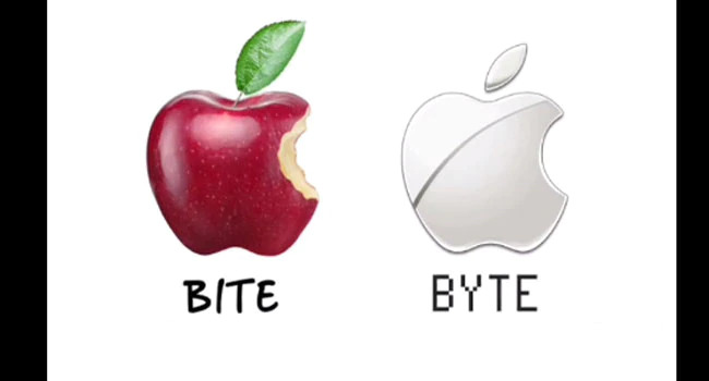
There was a very interesting incident while designing the Apple logo. Steve wanted the Apple company name to rise above Atari Corporation in the directory. This was the company where Steve Jobs, Wozniak, and Ronald Wayne worked.
The Apple logo was designed by Rob Janoff and he started drawing pictures bringing a box full of apples. Taking a bite from the apple was also part of this incident. At the same time, he realized that BITE appears to be exactly the same as the computing term BYTE. That’s how the Apple logo was created.
4. Toyota

The Toyota Company logo is designed in such a way that all the letters of the company name are visible. Apart from this, the company logo also shows the needle thread and the image that is given inside the circle is such that the thread goes inside the needle. This shows that the company started as a textile business.
Also read: 10 Rich & Successful Tech Company Owners Who Never Graduated College
5. Adidas

The logo of the company has always been changing, but there has been one thing in its logo. Three strips means three ridges. The recent logo has been made to look like three lines are forming a triangle. This shape is of a mountain where people should see how hard the players have to work.
6. BMW

Many people feel that the central part of the BMW actually represents a rotating fan. This shows the airplane as the history of BMW was like an aviation company. Actually it is the flag of Bavaria in Germany. This is where BMW started.
7. Baskin Robins

The Baskin Robbins logo consists of a half B and a R in pink. This is actually the number 31. The number 31 indicates the flavors that are the reason for the popularity of Baskin Robbins.
8. Vaio

The first two letters of the VAIO logo are the ones that show the analog signal, and finally I and O are designed in such a way that the binary numbers on the computer are 1 and 0. Binary number means digital signal.
9. LG
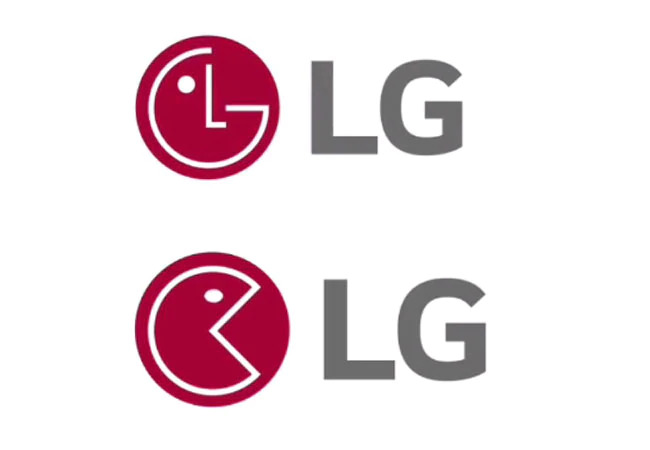
LG means Life Good, the logo is like the face it used to be in the Pacman game. This is a stylized photo of a person’s face. According to the company, it shows how much human behavior the company has with its customers.
Also read: Bizarre ‘Slash Jeans’ Worth ₹28k Is Making Netizens Go Crazy
10. Coca-Cola

The Danish flag appears between the letters O and L in the Coca-Cola logo. It would be considered a coincidence, but the company made its profit during marketing this in Denmark.


